|
Adolph Gottlieb and the Blanton Museum of Art |
|
|
by Sean Denmark
The other day, I was staring at a postcard of Adolph Gottlieb's 1959 painting "Cadmium Red over Black," a piece which belongs to the wonderful Michener collection of UT's Blanton Museum of Art, wondering why I so dislike it. It's a red circle over a black splotch on a white canvas, an image the painter was obsessed with later in his life; he produced a myriad of variations on the theme. When faced with abstract paintings (the Michener collection includes paintings by such important artists as Hofmann, Kline, Frankenthaler, Newman and Louis), some viewers are content to dismiss minimalist works with an "I could do that." Yet after seeing the Cy Twombly Gallery in Houston's Menil Collection, I can't say that. I didn't want to like Twombly; the man just scribbles and scratches. However, the problem was that a couple of months after visiting the gallery, I would see scratches on the wall at school and be reminded of him. Reality resembling art. Townbly had had the gall to invade a corner of my perception, and I couldn't be rid of him.
So I don't dismiss abstract and minimalist work completely. And this is why I found myself at the Blanton, studying the abstract, attempting to develop some sort of criteria for evaluation.
Has everyone heard the history of the Blanton Museum of Art? Here's the down, well-publicized, and dirty. The Blanton's varied collections are being displayed temporarily in two different campus buildings, the Harry Ransom Center and Art Building, while a permanent residence is being constructed.
With generous donations behind the project, an architecture advisory committee picked a big-name Swiss firm, Herzog and de Meuron -- those mod, square minimalists -- to design a new site for the collection. I confess, I think they're peachy keen and prestigious. In fact, this project would have been only their second US building. (The first, Dominus Winery in California, does not really suit my taste, but their 1992 design for a Munich gallery floats my boat).
In 1999, Herzog and de Meuron presented a design including five one story pavilions, defiantly low key for a building set on MLK. At the meeting, UT Regent Board member Rita Clements worried about the flat roofs. Regent Tony Sanchez honed in on the disparity between H&deM's proposal and the original one, a plan conceived long ago by Paul Cret. Sanchez even commented, "Why doesn't your museum look like this?" as he held up a picture of Cret's design. Thus, it was back to the drawing board, with H&deM devising a response to the Regents' concerns. The Board of Regents turned down the redesign. According to Lisa Germany (Architecture, Jan. 2000), Sanchez stole de Meuron and partner Gugger away to a kitchen after the meeting and showed them the plans he had ordered from another architect, apparently to provide a guide of sorts. H&deM resigned a few weeks later, feeling the differences to be irreconcilable.
The Regents' rejection of H&deM's designs created such a stir that UT Dean of Architecture Larry Speck resigned his own position in protest of the situation. But soon after, the whole selection process began again, producing a more conservative list of choices, from which the firm of Kellmann, McKinnell and Wood was culled. They'll probably produce a fine museum, but the thrill is definitely gone.
And I don't like how the paint lies on the canvas either; the proportions seem all wrong. Some of his less iconic statements of the theme are nice, but much of Gottlieb's popularity is based on the "oh yeah, I've seen this guy before" factor.
And I don't like how the paint lies on the canvas either; the proportions seem all wrong. Some of his less iconic statements of the theme are nice, but much of Gottlieb's popularity is based on the "oh yeah, I've seen this guy before" factor. Gottlieb = d-o-s; Pollock = dribbled paint; Louis = poured paint, etc.
As for the Blanton controversies, if you take the time to notice, the UT campus as a totality is ugly. A mishmash of big buildings currently hoard UT's sunlight and open areas. It seems designed to impede public gatherings: half of the West Mall is boxed in by shrubs, and walls line the Drag. And why has the courtyard of RLM been so useless for so long? To steal from an idea of Michael Sorkin's, I wonder if all this fuss over the museum is really disgust redirected from a mess of a campus that can't be fixed.
The H&deM design promised a breathing space which would have coupled a heady mixture of art with an escape from the PCLUGLRLM... In addition, it would have provided a gentle bridge between the twin monoliths of the state complex and UT. But one building can't fix a campus's problems; we've all been trained too long to accept ugly spaces.
Clements and Sanchez merely were abiding by the letter of UT's Campus Master Plan, a surprisingly foresighted 7-step program towards diminishing campus chaos, adopted by the Regents in 1996. It contains a pledge to, and I quote: "use the architectural language of Paul Cret's original works as the point of departure for the design of new structures." Furthermore, it assures us that "Red tile roofs are a positive identifier of the UT building character... [and] are considered appropriate for all new structures."
While H&deM kept the Cret Tradition in mind, it also recognized and sought to balance the effects of later campus additions. Mike Clark-Madison has pointed out how few of UT's recent constructions abide by these master plan ideals anyway ("Naked City," Austin Chronicle, Dec. 31, 1999). Does anyone bother to look at these buildings after they're actually built? Perhaps Sanchez and Clements are simply confusing whatever is currently on campus with what should be on campus.
Has this anything to do with Gottlieb? It would certainly help to tie together this review if it did, wouldn't it? If a parallel could be drawn between Gottlieb's work and the Blanton design, minimalism would be the scribbly line. Gottlieb strips his art down to easily recognized and monolithic images. But H&deM strip away door handles that are too easy to grab hold of. Maybe Sanchez preferred some conservative and easily recognized Platonic ideal of Cret architecture, too redundant to trouble us anymore.
|
||
top | this issue | ADA home |
||
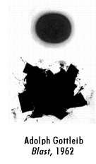 Back to Adolph Gottlieb's painting. It's as though someone asked for his autograph, and he grabbed for the nearest piece of canvas. If the dot-over-scribble image held any deep meaning for him, it was lost in the translation. Rather, the end result of his repetitive stamping of the d-o-s image was simply a menacing reminder that "this belongs to Gottlieb."